PivotTables: From Slicers to Dashboards
PivotTables: From Slicers to Dashboards

What you will learn
Excel PivotTables
Slicers
Dashboards
PivotCharts
Why take this course?
Excel PivotTables have been around for a while, but it’s only recently that the full power of PivotTables has been realised. Using PivotTables you can quickly and effortlessly extract and analyse your data in Excel. They are also interactive; you can filter data using ‘Slicers’ and ‘Timelines’, and from this data you can also create interactive ‘PivotCharts’.
Ultimately, you can create a Dashboard, which is a single ‘interactive’ worksheet that contains all your key information as a visual summary, ‘at a glance’.
Each lesson in the course is accompanied by the Excel file used in the demonstration with step-by-step instructions, and also an Excel exercise for you to practise in your own time. Note that we have now also added a zip file under Lesson 1 to download all course demo files in one go.
Disclaimer – although we have made every effort to ensure that the methods and techniques shown are Best Practice, we accept no liability for any costs that may be incurred as a result of incorrect use of Microsoft Excel. Microsoft Office is now continuously updated by Microsoft, with new features appearing at any time, sometimes unannounced; we shall endeavour to keep the course up to date, but you may find that some features have changed or are not yet covered on the course.
Screenshots


Reviews
Charts
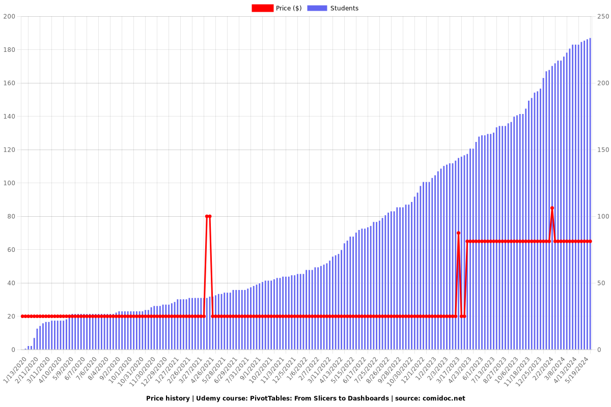
Price
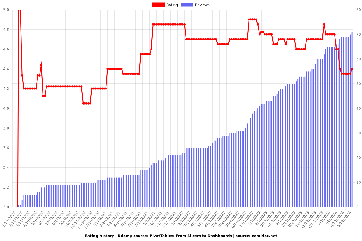
Rating
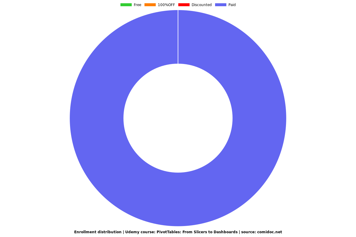
Enrollment distribution