Python Data Visualization with Matplotlib 2.x

Explore the world of amazing and efficient graphs with Matplotlib 2.x to make your data more presentable and informative

4.20 (16 reviews)
Udemy
platform
English
language
E-Commerce
category
103
students
4.5 hours
content
Nov 2017
last update
$19.99
regular price

What you will learn

Master with the latest features in Matplotlib 2.x

Create data visualizations on 2D and 3D charts in the form of bar charts, bubble charts, heat maps, histograms, scatter plots, stacked area charts, swarm plots, and many more.

Make clear and appealing figures for scientific publications.

Create interactive charts and animations.

Extend the functionalities of Matplotlib with third-party packages, such as Basemap, GeoPandas, Mplot3d, Pandas, Scikit-learn, and Seaborn.

Design intuitive infographics for effective storytelling.

Description

Big data analytics are driving innovations in scientific research, digital marketing, policy-making and much more. Matplotlib offers simple but powerful plotting interface, versatile plot types and robust customization.Matplotlib 2.x By Example illustrates the methods and applications of various plot types through real world examples. It begins by giving readers the basic know-how on how to create and customize plots by Matplotlib. It further covers how to plot different types of economic data in the form of 2D and 3D graphs, which give insights from a deluge of data from public repositories, such as Quandl Finance. You will learn to visualize geographical data on maps and implement interactive charts.By the end of this video, you will become well versed with Matplotlib in your day-to-day work to perform advanced data visualization. This video will help you prepare high quality figures for manuscripts and presentations. You will learn to create intuitive info-graphics and reshaping your message crisply understandable.

About the Author :

Aldrin Kay Yuen Yim is a PhD student in computational and system biology at Washington University School of Medicine. Before joining the university, his research

primarily focused on big data analytics and bioinformatics, which led to multiple discoveries, including a novel major allergen class (designated as a Group 24th Major allergen by WHO/IUIS Allergen Nomenclature subcommittee) through a multi-omic approach analysis of dust mites (JACI 2015), as well as the identification of the salt-tolerance gene in soybeans through large-scale genomic analysis (Nat. Comm. 2014). He also loves to explore sci-fi ideas and put them into practice, such as the development of a DNA-based information storage system (iGEM 2010, Frontiers in Bioengineering and Biotechnology 2014). Aldrin's current research interest focuses on neuro-development and diseases, such as exploring the heterogeneity of cell types within the nervous system, as well as gender dimorphism in brain cancers (JCI Insight 2017).

Aldrin is also the founding CEO of Codex Genetics Limited, which is currently servicing two research hospitals and the cancer registry of Hong Kong.

Allen Chi Shing Yu, PhD, is a Chevening Scholar, 2017-18, and an MSc student in computer science at the University of Oxford. He holds a PhD degree in Biochemistry from the Chinese University of Hong Kong, and he has used Python and Matplotlib extensively during his 10 years' experience in the field of bioinformatics and big data analysis. During his research career, Allen has published 12 international scientific research articles and presented at four international conferences, including on-stage presentations at the Congress On the Future of Engineering Software (COFES) 2011, USA, and Genome Informatics 2014, UK. Other research highlights include discovering the novel subtype of Spinocerebellar ataxia (SCA40), identifying the cause of pathogenesis for a family with Spastic paraparesis, leading the gold medalist team in 2011 International Genetically Engineered Machine (iGEM) competition, and co-developing a number of cancer genomics project.

Apart from academic research, Allen is also the co-founder of Codex Genetics Limited, which aims to provide personalized medicine services in Asia through the use of the latest genomics technology. With financial and business support from the HKSAR Innovation and Technology Commission, Hong Kong Science Park, and the Chinese University of Hong Kong, Codex Genetics has curated and transformed recent advances in cancer and neuro-genomics research into clinically actionable insights.

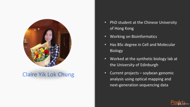
Claire Yik Lok Chung is now a PhD student at the Chinese University of Hong Kong working on Bioinformatics, after receiving her BSc degree in Cell and Molecular Biology. With her passion for scientific research, she joined three labs during her college study, including the synthetic biology lab at the University of Edinburgh. Her current projects include soybean genomic analysis using optical mapping and the next-generation sequencing of data. Claire started programming 10 years ago, and uses Python and Matplotlib daily to tackle Bioinformatics problems and to bring convenience to life. Being interested in information technology in general, she leads the Campus Network Support Team in college and is constantly keeping up with the latest technological trends by participating in PyCon HK 2016. She is motivated to acquire new skills through self-learning and is keen to share her knowledge and experience. In addition to science, she has developed skills in multilingual translation and graphic design, and found these transferable skills useful at work.

Content

Hello Plotting World!

The Course Overview
Getting Started with Matplotlib
Setting Up the Plotting Environment
Editing and Running Code
Loading Data for Plotting
Plotting Our First Graph

Figure Aesthetics

Basic Structure of a Matplotlib Figure
Setting Colors in Matplotlib
Adjusting Text Formats
Customizing Lines and Markers
Customizing Grids and Ticks
Customizing Axes
Using Style Sheets
Title and Legend

Figure Layout and Annotations

Adjusting Layout
Adding Subplots
Adjusting Margins
Drawing Inset Plots
Adding Text Annotations
Adding Graphical Annotations

Visualizing Online Data

Typical API Data Formats
Introducing Pandas
Visualizing the Trend of Data
Visualizing Univariate Distribution
Visualizing a Bivariate Distribution
Visualizing Categorical Data
Controlling SeabornFigure Aesthetics
More About Colors

Visualizing Multivariate Data

Getting End-of-Day (EOD) Stock Data from Quandl
Two-Dimensional Faceted Plots
Other Two-Dimensional Multivariate Plots
Three-Dimensional (3D) Plots

Adding Interactivity and Animating Plots

Scraping Information from Websites
Non-Interactive Backends
Interactive Backends
Creating Animated Plots

A Practical Guide to Scientific Plotting

Effective Visualization – Planning Your Figure
Effective Visualization – Crafting Your Figure
Visualizing Statistical Data More Intuitively
Methods for Dimension Reduction

Exploratory Data Analysis Analytics and Infographics

Visualizing Population Health Information
Map-Based Visualization for Geographical Data
Combining Geographical and Population Health Data
Survival Data Analysis on Cancer

Screenshots

Python Data Visualization with Matplotlib 2.x - Screenshot_01Python Data Visualization with Matplotlib 2.x - Screenshot_02Python Data Visualization with Matplotlib 2.x - Screenshot_03Python Data Visualization with Matplotlib 2.x - Screenshot_04

Reviews

Pavel
January 3, 2020
The Udemy version of this course does not seem to include Jupyter notebooks that are used throughout the course. You really need them! It is possible to get them for free from the publisher's (Packt) github site. Also, Packt is offering the same course for only $5. You will hear of a person seemingly reading matplotlib manual in a monotonous voice. It is easy to understand, but this soft robotic voice may also put you to sleep. A lot of features of matplotlib used in geenerating the plots are just quickly mentioned, or not mentioned at all. The most laborious part of creating a good matplotlib figure is adjusting various little things like annotations, ticks, axes, this is where you would spend most time. The course cruises through these topics quickly and just mentions some of the functions used. The Section 6 (interactivity) is particularly poor. Sections 7 and 8, however, provide good examples of using the plotting functionality on real datasets. Overall, this is an OK course that could be much better. It does give some starting point. It also covers the older version of matplotlib, as the 3.x is the current one.
Lucas
December 18, 2018
O curso mostra detalhes importantes sobre a visualização de dados, porém de forma muito rápida e sem material complementar como os notebooks e scripts das aulas.

Charts

Price

Python Data Visualization with Matplotlib 2.x - Price chart

Rating

Python Data Visualization with Matplotlib 2.x - Ratings chart

Enrollment distribution

Python Data Visualization with Matplotlib 2.x - Distribution chart
1427976
udemy ID
11/10/2017
course created date
3/9/2021
course indexed date
Bot
course submited by