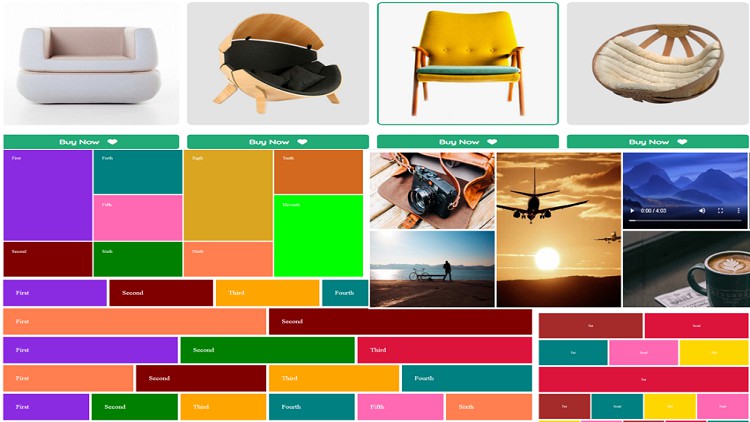
Mastery of Flexbox and CSS Grid - The Modern Practical Guide

Build Modern and Responsive Front-End Web Layouts using CSS Flexbox, CSS Grid and HTML, CSS. Master Flexbox and Grid

4.50 (8 reviews)
Udemy
platform
English
language
Web Development
category
instructor
Mastery of Flexbox and CSS Grid - The Modern Practical Guide
108
students
37 hours
content
Jan 2024
last update
$19.99
regular price

What you will learn

You will learn how to create various layout styles with CSS Grid and Flexbox

You will be able to create grid layouts using grid-template-areas

You will learn how to create equal and unequal columns/rows using both CSS Grid and Flexbox

You will be skilled on how to design MASONRY layout with flex and grid

You will learn how to use the fractional unit (fr) in CSS Grid

You will master how to create flex layouts with flex-basis

You will be skilled on how to work with implicit grid and explicit grid

You will learn how to use the CSS Media Query to make your web design mobile friendly and responsive.

You will learn how to create image gallery and video gallery with CSS Grid and Flexbox

You will be able to align and justify grid items and flex items

You will learn the difference between auto-fill & auto-fit in Grid

You will master how to use arbitrary grid line names in Grid

You will be able to work with ALL flexbox properties and ALL Grid properties step by step

You will creatively create the same web layout using flexbox and using grid

Why take this course?

This course is designed to make you a world class front-end web designer with CSS Grid and Flexbox as your tool. With the skills you will gather from this course, you can proudly create any website layout design from start to finish. It is an assurance because this Flexbox and CSS Grid course is modern, premium, adequately explained and well structured.


What you will learn.

You will be able to work with ALL flexbox properties and ALL Grid properties step by step

You will learn how to create various layout designs with CSS Grid and Flexbox

You will learn how to use the fractional unit (fr) in CSS Grid

You will be able to create responsive grid layouts using grid-template-areas

You will be skilled on how to design masonry layout with flex and grid

You will be skilled on how to work with implicit grid and explicit grid

You will learn the difference between auto-fill & auto-fit in Grid

You will be able to align and justify grid items and flex items

You will learn how to create image gallery and video gallery with CSS Grid and Flexbox

You will learn how to create equal and unequal columns/rows using both CSS Grid and Flexbox

You will master how to use arbitrary grid line names in Grid

You will be able to create navigation menus and mega menus. You will learn how to add images and videos to mega menus

You will be creative with how to use the CSS Media Query to make your web design mobile friendly and responsive. This means mobile-first approach.

You will learn how to import font awesome in order to incorporate it in your design

You will thoroughly learn how to import Google fonts as part of your font family

You will be able to apply some CSS properties to your layout design such as margin, padding, position, border properties, etc.


Content

Introduction

Introduction
No more need of floating items

Welcome to Flexbox Section

What is Flexbox
Comparing the display values on individual items
Comparing the display values on the parent

Flexbox Properties of the parent (container)

Understanding flex-direction and the two main axis
Flex-wrap with row and row-reverse
Flex-wrap with column
Flex-flow property
Justify-content on rows
Justify-content on column
Using margin:auto to separate flex items
Align-items property for rows
Align-items property for column
Align-items for a row when each flex item has a height
Align-content for rows
Align-content for column
Gap property for row
Gap property for column

Flexbox Layout Projects (With Row and Column)

Flexbox Row Project - 2 equal columns in one row
Flexbox Row Project - 3 equal columns in one row
Flexbox Row Project - 1 and 4 equal columns in one row
Flexbox Row Project - 5 equal columns in one row
Flexbox Row Project - creating separate rows
Flexbox Row Project - creating varying widths
Flexbox Row Project - space between
Flexbox Row Project - space between with varying widths
Flexbox Row Project - restricted width design
Flexbox Row Image gallery
Column Challenge 1
Flexbox Column Project - challenge 1 Solved
Column Challenge 2
Flexbox Column Project - challenge 2 Solved
Column Challenge 3
Flexbox Column Project - challenge 3 Solved
Column Challenge 4
Flexbox Column Project - challenge 4 Solved
Column Challenge 5
Flexbox Column Project - challenge 5 Solved
Column Image Gallery Challenge
Flexbox Column Image Gallery Project

Nesting Flex Items

Nesting flex items - rows
Nesting flex items - columns

Masonry Layout with flexbox

Masonry Layout with flexbox - 3 Columns
Masonry Layout with flexbox - 4 Columns
Masonry Layout with gaps
Image Gallery Masonry layout with flexbox

Flexbox Properties of the flex items (child element)

Order Property on Row - flex items
Order Property on Column - flex items
Flex-grow property on row - flex items
Flex-grow property on column - flex items
Flex-grow property on wrapped row and column - flex items
Proportionality of flex-grow
Flex-shrink Property on Row with % as flex-items width
Flex-shrink Property on Row with pixels as flex-items width
Flex-basis property
Flex shorthand property
Equal columns with flex basis
Mixed columns with varying flex basis
Align-self property
Centering Flex Items Vertically and Horizontally

Welcome to CSS Grid Section

Introduction To CSS Grid - display:grid

Explicit Grid (Grid Container)

Grid-template-columns
Grid-template-rows

Determining the grid track sizes

Using length units (px, em, rem, etc) and percentages on track sizes
Understanding percentages with grid-template-rows
Using auto, min-content, max-content, fit-content, fit-content()
Using the FR unit on track sizes
Using the minmax() function on track sizes
Using the repeat() function on track sizes

Auto-fill versus Auto-fit

Using auto-fit or auto-fill on track sizes
Using auto-fit or auto-fill with minmax() on track sizes

grid-template and grid shorthand

grid-template and grid shorthand properties

Grid gap

Gaps (Gutters) in grid layout

Nesting Grid layout

Nesting Grids - part 1
Nesting Grids - part 2

Implicit Grid (Grid Container)

Implicit Grids - part 1
Implicit Grids - part 2
Grid shorthand property with implicit grids
Responsive layout and implicit grid

Ordering Grid items

Order property

Positioning of Grid Items

grid-column-start/grid-column-end
grid-auto-flow:dense
grid shorthand with auto-flow dense
grid-row-start/grid-row-end
Combining and spanning the positions of grid items
Span keyword on rows and columns
Grid Gallery Project
Grid-row and grid-column shorthand property
grid-area shorthand property
Making the layout responsive with unset and auto-fill and order
Flexbox Row Layout Challenge
Flexbox Row Layout challenge solved
Flexbox Column Layout Challenge
Flexbox Column Layout challenge solved

Layering Grid Items

Layering Column Grid Items
Layering Row Grid Items

Arbitrary Grid Line Names

Arbitrary grid Line Names on Columns
Arbitrary grid Line Names on Rows
Arbitrary grid Line Names on Rows and Columns
More than one Arbitrary grid Line Names on Rows and Columns
Using repeat( ) function with Arbitrary grid Line Names
Grids with the SAME arbitrary grid line names

Grid-Template-Areas

Grid-template-areas (Part 1)
Grid-template-areas (Part 2)
Grid-template-areas (Part 3)
Responsiveness of grid-template-areas
Using Grid-template shorthand with grid-template-areas

Masonry Layout with Grid

Grid Masonry Layout - Part 1
Grid Masonry Layout - Part 2
Grid Masonry Gallery Layout

Justifying and Aligning Grid Items

Justify-items
Align-items
Position Items to center and place-items shorthand
Justify-content
Align-Content
Position Contents to center and place-content shorthand
Justify-self/ Align-self/ place-self

Building Navigation Layout with Grid and Flex layout

Introduction to Flexbox-Grid Navigation Layout
Basic Flexbox-Grid Navigation Layout
Grid-Flexbox Drop Down Menu Layout - part 1
Grid-Flexbox Drop Down Menu Layout - part 2
Grid-Flexbox Sub-menu drop down
Responsiveness of the navigation bar - part 1
Responsiveness of the navigation bar - part 2
Responsiveness of the navigation bar - part 3
Introduction to Flexbox-Grid Mega Menu Layout
Mega Menu Layout
Responsiveness of the Mega Menu - Part 1
Responsiveness of the Mega Menu - Part 2
Responsiveness of the Mega Menu - Part 3
Responsiveness of the Mega Menu - Part 4
Structuring the background image
Applying Google Fonts

Final Web Layout Project

Introduction to the Flexbox Ecommerce Project
Basic structuring of the Web Project
Styling the Ecommerce Section - Part 1
Styling the Ecommerce Section - Part 2
Creating the HTML layout of the other sections
Finish Styling the Layout
Responsiveness of the project - part 1
Responsiveness of the project - part 2
Designing the same project with Grid Layout
Final Notes - Differences between Grid and Flex

Reviews

Tim
December 18, 2022
I didn't complete this course, but it's not because I gave up. I felt confident enough to complete the final website and challenges on my own. This was an important course for me, because I've done a bunch of other HTML courses, but I haven't learned how to create a website layout properly. What's the point of learning about fonts, images, links, if you can't layout a responsive web page? I encourage anyone learning HTML for this to be your first course. I'm confident moving forward with my learning journey.

Charts

Price

Mastery of Flexbox and CSS Grid - The Modern Practical Guide - Price chart

Rating

Mastery of Flexbox and CSS Grid - The Modern Practical Guide - Ratings chart

Enrollment distribution

Mastery of Flexbox and CSS Grid - The Modern Practical Guide - Distribution chart

Related Topics

4655746
udemy ID
4/23/2022
course created date
6/7/2022
course indexed date
Bot
course submited by