Practical CSS3 Flexbox Media Queries & CSS Grid Mastery

Learn to build responsive websites with the help of CSS3 Flexbox, CSS Grid, Media Queries & how to use Git and Github

4.70 (138 reviews)
Udemy
platform
English
language
Web Development
category
16,718
students
2 hours
content
Sep 2022
last update
$44.99
regular price

What you will learn

You will learn about Responsive web design and development

You will learn all concepts of Flexbox and how to use them

You will learn the concepts of Media Queries and how to use them

You will learn CSS Grid and how to use it for responsive web design

You will learn to use HTML and CSS3

You will learn the basics of Git and Github, commit your code to github

You will learn to use Visual Studio Code editor and related extension

Description

In the course, you will learn all the concepts of flexbox and media queries.

We will learn all the concepts with the help of code examples.

Following are the topics we will cover:

1.1-Installing VS Code and Server extension

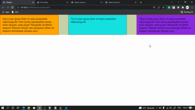
1.2-Introduction to Flexbox

1.3-Setup index.html and style.css files

1.4- Reset margin padding box-sizing on universal operator

1.5-Styling the Boxes

1.6-Apply display flex on parent

1.7-Flex Direction row row-reverse column column-reverse

1.8-Flex grow shrink

2.1-Justify Content Flex Start

2.2-Justify Content Flex End

2.3-Justify Content Center

2.4-Justify Content Space-Around

2.5-Justify Content Space-Between

3.1-Why you should not use Float property

3.2-Align Item Flex End

3.3-Align Item Flex Start

3.4-Align Item Center

3.5-Flex Basis same as Width on Flex Item

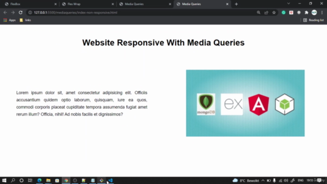
4.1-Responsivesness with Media Query

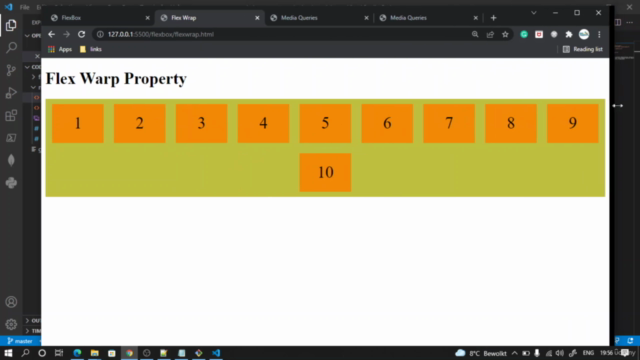
4.2-Flex Wrap Layout Creation

4.3-Styling the Flex layout

4.4-Making Screen Responsive with Flex Wrap

4.5-Enhancing the responsiveness

1.1-What is meant by Responsiveness

1.2-Example Non_responsive website

1.3-Creating HTML Skeleton for non-responsive website

1.4-Styling the non responsive page

2.1-Different Device break points

2.2-Make Responsive in device upto 768px

2.3-Make Responsive for device width upto 468px

2.4-Make Responsive for device width above 1024px

2.5-Making Responsive between 769px and 1023px

Creating account on Github

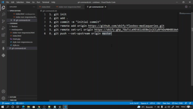
Installing Git bash

Creating github token and connecting from local

Using git commands to commit and push our local code

You will get the complete source code

Content

Introduction and Setup

Course Overview
Installing VS Code and Server extension
Introduction to Flexbox
Setup index.html and style.css files
Reset margin padding box-sizing on universal operator
Styling the Boxes

Working with Flexbox

Apply display flex on parent
Flex Direction row row-reverse column column-reverse
Flex grow shrink
Justify Content Flex Start
Justify Content Flex End
Justify Content Center
Justify Content Space-Around
Justify Content Space-Between
Why you should not use Float property
Align Item Flex End
Align Item Flex Start
Align Item Center
Flex Basis same as Width on Flex Item
Responsivesness with Media Query
Flex Wrap Layout Creation
Styling the Flex layout
Making Screen Responsive with Flex Wrap
Enhancing the responsiveness

Media Queries and Responsive Web Development

What is meant by Responsiveness
Example of Non_responsive website
Creating HTML Skeleton for non-responsive website
Styling the non responsive page

Media Queries Breakpoint for different devices

Different Device break points
Make Responsive in device upto 768px
Make Responsive for device width upto 468px
Make Responsive for device width above 1024px
Making Responsive between 769px and 1023px

Git and Github

Git and Github Part-1
Git and Github Part-2
Git and Github Part-3
Git and Github Part-4

CSS Grid

Setup Html and Css Layout - Part-1
Setup Html and Css Layout - Part-2
Background color to boxes

Source code

Source code

Screenshots

Practical CSS3 Flexbox Media Queries & CSS Grid Mastery - Screenshot_01Practical CSS3 Flexbox Media Queries & CSS Grid Mastery - Screenshot_02Practical CSS3 Flexbox Media Queries & CSS Grid Mastery - Screenshot_03Practical CSS3 Flexbox Media Queries & CSS Grid Mastery - Screenshot_04

Reviews

Shrushti
July 12, 2023
I appreciate the way you explained the concept. & I like the way how you divide important points and step into small parts._.
Ninos
February 5, 2023
good explanation and everything was perfect, just I have a note if the course contains real website examples that will make an excellent course. Thank you
Anna
February 4, 2023
Great explanation about media queries and useful additional information about git and GitHub. Thank you
Rimvydas
May 5, 2022
I already knew most of the things, but now I understand that you can also use the functions of css. However, a very important point is not mentioned, the priority of application e.g. <link rel="stylesheet" href="style.css"> <style> #first { color:green; } </style> <p id="first" style="color:red;">what color is this text ?</p> <p style="color:red;">I am red</p> and !important...
Marlon
April 13, 2022
I am an aspiring frontend developer and this course is helping me make my responsive development part strong

Coupons

DateDiscountStatus
3/11/2022100% OFF
expired
3/15/2022100% OFF
expired
4/3/2022100% OFF
expired
5/25/2022100% OFF
expired
5/27/2022100% OFF
expired
6/4/2022100% OFF
expired
6/7/2022100% OFF
expired
6/8/2022100% OFF
expired
7/1/2022100% OFF
expired
9/1/2022100% OFF
expired
9/3/2022100% OFF
expired
1/22/2023100% OFF
expired
1/29/2023100% OFF
expired
1/29/2023100% OFF
expired
2/1/2023100% OFF
expired
6/30/2023100% OFF
expired
3/23/2024100% OFF
expired
3/23/2024100% OFF
expired

Charts

Price

Practical CSS3 Flexbox Media Queries & CSS Grid Mastery - Price chart

Rating

Practical CSS3 Flexbox Media Queries & CSS Grid Mastery - Ratings chart

Enrollment distribution

Practical CSS3 Flexbox Media Queries & CSS Grid Mastery - Distribution chart

Related Topics

4552836
udemy ID
2/15/2022
course created date
2/28/2022
course indexed date
Bot
course submited by