[2023] Introduction to Data Analytics with Microsoft Excel

Master data analysis through Excel with advanced hands on practical training

4.30 (126 reviews)
Udemy
platform
English
language
Microsoft
category
instructor
6,153
students
3.5 hours
content
Dec 2022
last update
$79.99
regular price

What you will learn

What is Data Analytics & Why is it so Important

Why Do We Need Analytics? What's Changed?

How to Find Appropriate Datasets to work with

How to Analyse you Data

The importance of Mean, Mode, Median and Range of Data

What is the difference between Normal and Non Normal Data

How to create a histogram

How to find and remove outliers

Understand what is a standard deviation and relative standard deviation

Understand the Difference Between a Run and a Control Chart?

The basics of working with pivot tables

Starting to Tell Our Analytical Story

How to Visualize our data

How to Present You data and bring the story together

Description

Requirements

  • Microsoft Office 365 or Excel 2010 - 2019

  • Mac users Pivot Visuals may look slightly different to the examples shown

  • Basic experience with Excel functionality is a bonus but not required

Description

Welcome to the world of Data Analytics, voted the sexiest job of the 21st Century.

In this expertly crafted course, we will cover a complete introduction to data analytics using Microsoft Excel, you will cover the concepts, the value and practically apply core analytical skills to turn data into insight and present as a story.

Look at this as the first step in becoming a fully-fledged Data Scientist


Course Outline

The course covers each of the following topics in detail, with datasets, templates and 17 practical activities to walk through step by step:

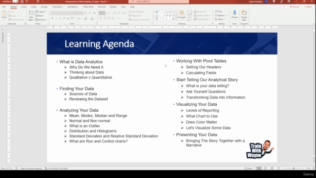
What is Data Analytics

  • Why Do We Need It in this new world

  • Thinking about Data, how it works in the lad v how it works in the wild

  • Qualitative v Quantitative data and their importance

Finding Your Data

  • How to find Sources of Data and what they contain

  • Reviewing the Dataset and getting hands on

Analysing Your Data

  • Mean, Modes, Median and Range

  • Normal and Non normal Data and its impacts to predictability

  • What is an Outlier in our data and how do we remove

  • Distribution and Histograms and why they are important

  • Standard Deviation and Relative Standard Deviation, why variance is the enemy

  • What are Run and Control charts and what do they tell us?


Working With Pivot Tables

  • How the Pivot Builder Works

  • Setting Our Headers

  • Working with calculated fields

  • Sorting and Filtering

  • Transforming Data with Pivot Tables


Data Engineering

  • How to create new, insightful datasets

  • The importance of balanced data

  • Looking at Quality, Cost and Delivery together


Start Telling Our Analytical Story

  • What is your data telling?

  • Ask Yourself Questions

  • Transforming Data into Information


Visualizing Your Data

  • Levels of Reporting

  • What Chart to Use

  • Does Color Matter

  • Let's Visualize Some Data


Presenting Your Data

  • Bringing The Story Together with a Narrative


Practical Activities

We will cover the following practical activities in detail through this course:

  • Practical Example 1 - Mean, Mode, Median, Range & Normality

  • Practical Example 2 - Distribution and Histograms

  • Practical Example 3 - Standard Deviation and Relative Standard Deviation

  • Practical Example 4 - A Little Data Engineering

  • Practical Example 5 - Creating a Run Chart

  • Practical Example 6 - Create a Control Chart

  • Practical Example 7 - Create a Summary Pivot of Our Claims Data

  • Practical Example 8 - Transforming Data

  • Practical Example 9 - Calculated Fields, Sorting and Filtering

  • Practical Example 10 - Lets Engineer Some QCD Data

  • Practical Example 11 - Lets Answer Our Analytical Questions with Pivots

  • Practical Example 12 - Visualizing Our Data

  • Practical Example 13 - Lets Pull our Strategic Level Analysis Together

  • Practical Example 14 - Lets Pull our Tactical Level Analysis Together

  • Practical Example 15 - Lets Pull our Operational Level Analysis Together

  • Practical Example 16 - Lets Add Our Key Findings

  • Practical Example 17 - Lets Add Our Recommendations

Who this course is for:

  • Anyone who works with Excel on a regular basis and wants to supercharge their skills

  • Excel users who have basic skills but would like to become more proficient in data exploration and analysis

  • Students looking for a comprehensive, engaging, and highly interactive approach to training

  • Anyone looking to pursue a career in data analysis or business intelligence

Content

Introduction

Get to Know a little about me and my experience

Course Overview

What Will This Course Cover?
How to Get an Office 365 Trial for Free
Additional Resources

What is Data Analytics?

Is Analytics Right for Me?
What is Data Analytics
Think About Data
What is Qualitative v Quantitative Data?
What is Data Analytics?

Finding Your Data

Finding Your Data
Finding Your Data

Analysing Your Data Part 1

Mean, Mode, Median & Range of Data
Normal v Non-Normal Data
What is an Outlier?
Data We Will Be Using as Part of This Course
Data Intimacy
Practical Example 1 - Mean, Mode, Median, Range & Normality
Practical Activity
Mean, Mode, Median, Range & Normality

Analysing Your Data Part 2

What will this section cover?
Distribution and Histograms
Standard Deviation & RSD
What is a Run Chart? & Data Engineering
Practical Example 5 - Creating a Run Chart
Practical Example 6 - Create a Control Chart

Working with Pivot Tables

What will this section cover?
Why do we use Pivot tables?
Practical Example 7 - Create a Summary Pivot of Our Claims Data
Create a Summary Pivot of Our Claims Data
Transforming Data with the Pivot Builder
Practical Example 8 - Transforming Data
Transforming Data
Using Calculated Fields, Sorting and Filtering
Practical Example 9 - Calculated Fields, Sorting and Filtering
Calculated Fields, Sorting and Filtering
Data Engineering 2.0
Practical Example 10 - Lets Engineer Some QCD Data
Lets Engineer Some QCD Data

Start Telling Our Analytical Story

The Start of Our Story
Practical Exercise 11 - Part 1 - Quality Performance
Quality Performance
Practical Exercise 11 - Part 2 - Cost Performance
Cost Performance
Practical Exercise 11 - Part 3 - Performance By Day
Performance By Day
Practical Exercise 11 - Part 4 - Paid/Denial Rate Over The Month
Paid/Denial Rate Over The Month
Practical Exercise 11 - Part 5 - Paid/Denial Rate By Day of Week
Paid/Denial Rate By Day of the Week
Practical Exercise 11 - Part 6 - Paid/Denial Outcome Impact on Quality
Paid/Denial Outcome Impact on Quality
Practical Exercise 11 - Part 7 - Paid/Denial Outcome Impact on Costs
Paid/Denial Outcome Impact on Costs
Practical Exercise 11 - Part 8 - Volume of Claims by Claim Type
Volume of Claims by Claim Type
Practical Exercise 11 - Part 9 - Claim Type Impact on Quality
Claim Type Impact on Quality
Practical Exercise 11 - Part 10 - Claim Type Impact on Paid/Denial Rate
Claim Type Impact on Paid/Denial Rate
Practical Exercise 11 - Part 11 - Claim Type Impact on Costs
Claims Type Impact on Costs
Practical Exercise 11 - Part 12 - Paid/Denial Rates per Individual
Paid/Denial Rates per Individual
Practical Exercise 11 - Part 13 - Quality Performance per Individual
Quality Performance per Individual
Practical Exercise 11 - Part 14 - Cost Performance per Individual
Cost Performance per Individual
Practical Exercise 11 - Part 15 - Individual Delivery Performance By Day of the
Individual Delivery Performance By Day of the Week

Data Visualization

Data Visualization
Practical Example 12 - Visualizing Our Data

Presenting Your Data

Bringing the Story Together
Practical Example 13 - Lets Pull our Strategic Level Analysis Together
Practical Example 14 - Lets Pull our Tactical Level Analysis Together
Practical Example 15 - Lets Pull our Operational Level Analysis Together
Practical Example 16 - Lets Add Our Key Findings
Practical Example 17 - Lets Add Our Recommendations

And That's a Wrap

Course Wrap Up

Screenshots

[2023] Introduction to Data Analytics with Microsoft Excel - Screenshot_01[2023] Introduction to Data Analytics with Microsoft Excel - Screenshot_02[2023] Introduction to Data Analytics with Microsoft Excel - Screenshot_03[2023] Introduction to Data Analytics with Microsoft Excel - Screenshot_04

Reviews

Kayleigh
August 3, 2023
Before discovering Wayne’s course I had no prior knowledge of Data Analytics but he broke everything down in a clear and concise way, explaining everything thoroughly and in a language that all viewers could understand. Couldn’t recommend highly enough
Rachel
July 30, 2023
Great course material. Wayne was engaging throughout and explained everything really clearly - definitely recommend!!
Grace
July 30, 2023
I found this course extremely helpful and easy to understand. It really provide an in depth comprehension.
Michael
July 29, 2023
Fantastic course. I didnt have any data analysis experience but this has set me on my way. Wayne is an excellent tutor.
Gianluca
March 26, 2023
Amazing course with real exercizes that improve analytics skills. Really great teachings. Thank you Wayne.
Jesse
March 19, 2023
It was alright. I found it strange the instructor forces his students to answer correctly should trust a god in a quiz. Otherwise, the course seems to meet expectations.
Joshua
February 3, 2023
yes, it was a good match for me. It wasn't easy learning online when there is a network challenge, but am grateful for everything.
Samuel
January 7, 2023
There are some missing videos like in 53. Practical Example 15 - Lets Pull our Operational Level Analysis Together. I don't know if its just me but there is only 1 min video about getting Office 365 and not anything related to the Operational Level Analysis.
Hande
December 25, 2022
The course was very instructive, and it will be extremely beneficial to my work. Ideal for newcomers to Microsoft Excel's Introduction to Data Analytics. I am excited to learn more.
Linda
December 25, 2022
I've learned a lot about Data Analytics with Microsoft Excel. There is a very good discussion on Theory. So far so good! Highly recommended. Shirley Pursell
Belayet
December 25, 2022
Access Your Data Analytics with Microsoft Excel course is absolutely brilliant! Thank you very much indeed for your teaching!
Pablo
December 25, 2022
It was an unforgettable experience. He does an excellent job of explaining concepts and guiding you through the material! Take this course to learn how to use Microsoft Excel for Data Analytics.
Lamia
December 25, 2022
A very effective course. The teacher is an agreeable individual which makes you simple to follow. Lamia Tabassum
Pitte
December 25, 2022
Data Analytics with Microsoft Excel, it was very interesting to see your Teching. Your technic is very very easy, so helpful. Thank you
Md
December 25, 2022
Thanks for making the Data Analytics with Microsoft Excel course easy for me to understand. I'm really enjoying it. Md Ashik Rana

Coupons

DateDiscountStatus
12/27/2022100% OFF
expired
12/30/2022100% OFF
expired
1/2/2023100% OFF
expired
1/3/2023100% OFF
expired
2/10/2023100% OFF
expired

Charts

Price

[2023] Introduction to Data Analytics with Microsoft Excel - Price chart

Rating

[2023] Introduction to Data Analytics with Microsoft Excel - Ratings chart

Enrollment distribution

[2023] Introduction to Data Analytics with Microsoft Excel - Distribution chart
4823508
udemy ID
8/9/2022
course created date
10/11/2022
course indexed date
Bot
course submited by