Excel Charts - Visualization Secrets for Impressive Charts
Gain Highly Advanced Excel Skills to Create Impressive Excel Graphs for your Management Reports (Excel 2010)
4.55 (6449 reviews)

34,968
students
8.5 hours
content
Jan 2025
last update
$94.99
regular price
What you will learn
Significantly improve your Excel reports to create more powerful graphs that communicate your information in the best manner
Learn creative & simple techniques that allow you to create your own Excel charts from scratch
Create dynamic Excel charts. Why? I have seen many cases where people are unnecessarily manually updating graphs. This costs considerable time and nerves.
Impress your management by including new Excel graphs in your reports (such as my Pin chart for variances)
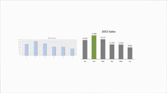
Apply Best Practice methods to considerably improve the design of your Excel charts and tables
Apply techniques that highlight chart and table elements to direct the reader attention where it is needed most
Use effective Chart Combinations that are pivotal to management reports
Apply best methods to compare performance in your Excel graphs: as in Actual data versus Budget, forecasts and previous year
Learn by doing. Download the Demo Excel Workbook and follow each section with me. Learning by doing works best!
Learn advanced Excel lookup methods (such as matrix lookups) which you can use in your larger data files.
Become the Excel data Visualization star in your department by creating impressive Excel charts and graphs in your reports
Screenshots


Related Topics
656432
udemy ID
10/31/2015
course created date
11/1/2019
course indexed date
Bot
course submited by