Excel Crash Course: Dashboards, Data Analysis & Heatmaps

Learn core, business-focused Excel skills for data analysis, data visualisation and dashboard modelling in 3 hours

4.25 (282 reviews)
Udemy
platform
English
language
Microsoft
category
instructor
18,477
students
3 hours
content
Sep 2020
last update
$44.99
regular price

What you will learn

Explore Microsoft Excel from a data science & data visualisation and data analysis perspective

Design three dashboard systems in Excel - Twitter Activity Heatmap, Advanced Currency Converter, Business Invoicing Dashboard

Learn to use Excel dynamic arrays with other functions like a pro to build automated systems

Manipulate pivot tables to design beautiful, custom charts and heatmap visuals

Work with Excel time intelligence and text functions to extract HOUR of DAY, DAY of WEEK etc

Tips and tricks to fine tune your Excel dashboards and visuals to supercharge your data visualisation skills

Test your data analysis skills by working on data retrieved from Twitter API

Learn HOW to maximize office productivity and potentially increase your pay

Description

This is a 100% project-based Microsoft Excel crash course with a special focus on data analysis, designing simple dashboards and creating heatmap visuals and other charts. Maximizing office productivity is a key skill to learn. By working with modern Excel tables and learning how to extract insights from data, you'll achieve a leap in your Excel skills in 3 hours.


Supercharge your Microsoft Excel skills rapidly in this Crash Course!

As a Business Intelligence consultant, I designed the curriculum based on some of the skills needed to get you powering through your daily business needs, and I’ve designed the courses to achieve specific objectives. This course is a hack to develop advanced power-user skills in Microsoft Excel on Office 365 in a very short period of time.


Students will work on two different datasets - Twitter data and fuel prices data - to design dashboards and extract insights using Pivot tables and beautiful heat maps.

In this course you will learn how to:

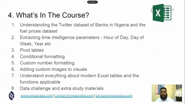
  1. Explore Microsoft Excel from a data science, data visualisation and data analysis perspective

  2. Design three dashboard systems in Excel - Twitter Activity Heatmap, Advanced Currency Converter, Business Invoicing Dashboard

  3. Work with Excel time intelligence and text functions to extract HOUR of DAY, DAY of WEEK etc

  4. Manipulate pivot tables to design effective and beautiful charts and heatmap visuals

  5. Design and customise pivot charts by adding custom images

  6. Use the Power Query tool to manipulate and mashup data

  7. Use certain tips and tricks to fine-tune your Excel dashboards and visuals to supercharge your data visualisation skills

  8. Test your data analysis skills by working on data retrieved from Twitter API

  9. Learn HOW to maximize office productivity and increase your salary with automation skills


Why Excel skills matter

Advanced Microsoft Excel skills can open up a whole myriad of career opportunities in business analysis, product management, data analysis, operations and strategy roles. As a skilled Excel user that is able to extract insights from data, you will be comfortable in working in industries such as finance, consulting, manufacturing, pharmaceutical, analytics or other business roles. Excel is the primary spreadsheet application used in financial modelling and ad-hoc data analysis.

In this 100% example-based and project-based course, you’ll develop highly marketable business-focused Excel skills in data analysis and data visualisation to help you outperform competing candidates for promotions, job opportunities, and internships. You’ll learn what it means to be the Excel go-to person having an unfair advantage in analytical skills.


How is the course structured?

The course curriculum has been designed as a project-based, crash course. You will learn rapidly by working through the Twitter dataset to understand rudimentary data analysis and design novel heatmaps. Then in the latter half of the course, you will learn how to work with modern Excel tables and manipulate them using the Power Query tool, structured referencing, and using the functions available on Office 365 version of Excel to craft automated calculations and dashboards.

The course builds on itself, meaning that as we continue forward in the course we’ll re-use the concepts from previous sections to further reinforce them. All of the material is 100% example-based and we’ll use multiple real-life examples throughout the course.

The course is composed of 18 short lectures each of which covers one concept at a time, and 2 problem-solving sessions (data challenges). The full course length is 1.8 hours of well thought out, deliberate content to get you building and designing within Excel. You will also get over 1 hour of practice problems which are very detailed and cover real-life analytical scenarios.

I designed this course to be as practical and as relatable as possible by using sample data from real-life activities. The course is complete with working files, you’ll be able to follow along practising each concept and receive a verifiable certificate of completion when you finish the course!

It's a crash course so be ready to take a leap!

Are there any course requirements or prerequisites?

  • Preferably Excel on Office 365 for Windows. Microsoft Excel 2010-2019 (PC/Windows)

  • Mac users are welcome but note that the interface of Pivot Tables varies across platforms

  • Knowledge of Excel for basic reporting is an added advantage but not required

  • Be ready to make a leap. It's a crash course

Who this course is for:

  • Beginner in Excel interested in data analysis

  • More advanced users looking to learn how to improve office productivity

  • Business students curious about data visualization

  • Business professionals interested in data analysis and modelling

  • Crash course enthusiasts

  • Python developers and coders interested in data analysis and Excel

Content

Analysis of Twitter Dataset and Designing Heatmaps

Introduction to the Excel crash course
Understanding the Twitter Dataset
Extracting Other Details for Analysis
Creating Pivot Tables
Applying Conditional Formatting using Color Scales
Adding Slicers to Dashboard
Applying Custom Number Formats
Adding Custom Images to Charts
Interlude - Data Manipulation Challenge
Adding Heatmap Legend
Wrapping Up - Introduction to Open Analytics

Working with Modern Excel Tables

Introduction to Modern Excel Tables
Using Power Query for Data Manipulation
Applying Power Query Data Transformations
Structured Table Referencing
XLOOKUP Function and Pivot Table Calculations

Additional Content

Analyzing an On-Demand Rides Dataset

Screenshots

Excel Crash Course: Dashboards, Data Analysis & Heatmaps - Screenshot_01Excel Crash Course: Dashboards, Data Analysis & Heatmaps - Screenshot_02Excel Crash Course: Dashboards, Data Analysis & Heatmaps - Screenshot_03Excel Crash Course: Dashboards, Data Analysis & Heatmaps - Screenshot_04

Reviews

Olawoyin
June 10, 2021
Insightful and I am enjoying it. I appreciate the simplicity around the explanation devoid of any ambiguity.
Onis
January 21, 2021
Amazing course, although I am not a beginner. In about 5 hours I was able to complete the course and gain valuable skills.
Oluwatobi
November 26, 2020
The tutor's approach to teaching is top-notch and 100% practical. I would recommend this course to Excel users of any level of proficiency. This course arguably ranks among my top 3 online courses ever. Thanks, Mr. Oluwatobi, I am glad we have connected on LinkedIn already and I am looking forward to learning more from you.
Tony
October 30, 2020
It was a packed course, I learned so much in a short time. I never knew excel had so many capabilities. Instructor was very knowledgeable in this area
Catherine
September 2, 2020
The pace of this one is good, given there is an expectation of basic Excel knowledge. I'm learning more useful tips and tricks more quickly than I expected. Thank you!
Rahul
August 24, 2020
It was definitely a good match for me.Also, I got to understand more concepts in a crystal clear way.Thank you for this wonderful course.This course benefits me for my career and personnel growth.Thank you once again.
Jonathan
August 22, 2020
Thanks so much for putting this course together. The course is packed with so much practical tips and easy to follow guide. I enjoyed every bit of the time I spent on it and learnt so much also.
Anuj
August 21, 2020
I understand the user is trying to have a conversation but if he talks a little to the point then that might be more useful. Since, this is a technical skill training, the user is already in the right frame of mind and not looking to be molded in that frame of mind.
Aravinth
August 19, 2020
It was a helpful refresher - thank you! I'd have given 5 if the course had touched upon more features and/or complex use-cases.
Monica
August 19, 2020
Aunque hay algún contenido que está bien , la forma de explicar del enseñante no considero que sea buena. Demasiadas pausas para pensar y el discurso, la sonoridad , el ritmo empleados no considero sean atractivos
Sulaiman
July 15, 2020
It's a no brainer that this course is top notch. I have a learnt a lot from watching just the first three videos/modules!. I'm really excited about this.

Coupons

DateDiscountStatus
7/21/2020100% OFF
expired
8/19/2020100% OFF
expired

Charts

Price

Excel Crash Course: Dashboards, Data Analysis & Heatmaps - Price chart

Rating

Excel Crash Course: Dashboards, Data Analysis & Heatmaps - Ratings chart

Enrollment distribution

Excel Crash Course: Dashboards, Data Analysis & Heatmaps - Distribution chart
3303320
udemy ID
7/5/2020
course created date
7/21/2020
course indexed date
Bot
course submited by