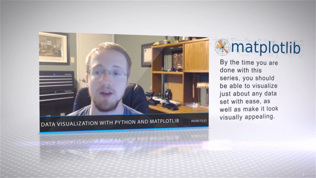
Data Visualization with Python and Matplotlib

Python,Data Visualization,Matplotlib

4.10 (466 reviews)
Udemy
platform
English
language
Programming Languages
category
4,420
students
6 hours
content
Feb 2017
last update
$49.99
regular price

What you will learn

Visualize multiple forms of both 2D and 3D graphs, like line graphs, scatter plots, bar charts, and more

Load data from files or from internet sources for data visualization.

Create live graphs

Customize graphs, modifying colors, lines, fonts, and more

Visualize Geographical data on maps

Description

More and more people are realising the vast benefits and uses of analysing big data. However, the majority of people lack the skills and the time needed to understand this data in its original form. That's where data visualisation comes in; creating easy to read, simple to understand graphs, charts and other visual representations of data. Python 3 and Matplotlib are the most easily accessible and efficient to use programs to do just this.

Learn Big Data Python

Visualise multiple forms of 2D and 3D graphs; line graphs, scatter plots, bar charts, etc.

Load and organise data from various sources for visualisation

Create and customise live graphs

Add finesse and style to make your graphs visually appealling

Python Data Visualisation made Easy

With over 58 lectures and 6 hours of content, this course covers almost every major chart that Matplotlib is capable of providing. Intended for students who already have a basic understanding of Python, you'll take a step-by-step approach to create line graphs, scatter plots, stack plots, pie charts, bar charts, 3D lines, 3D wire frames, 3D bar charts, 3D scatter plots, geographic maps, live updating graphs, and virtually anything else you can think of!

Starting with basic functions like labels, titles, window buttons and legends, you'll then move onto each of the most popular types of graph, covering how to import data from both a CSV and NumPy. You'll then move on to more advanced features like customised spines, styles, annotations, averages and indicators, geographical plotting with Basemap and advanced wireframes.

This course has been specially designed for students who want to learn a variety of ways to visually display python data. On completion of this course, you will not only have gained a deep understanding of the options available for visualising data, but you'll have the know-how to create well presented, visually appealing graphs too.

Tools Used

Python 3: Python is a general purpose programming language which a focus on readability and concise code, making it a great language for new coders to learn. Learning Python gives a solid foundation for learning more advanced coding languages, and allows for a wide variety of applications.

Matplotlib: Matplotlib is a plotting library that works with the Python programming language and its numerical mathematics extension 'NumPy'. It allows the user to embed plots into applications using various general purpose toolkits (essentially, it's what turns the data into the graph).

IDLE: IDLE is an Integrated Development Environment for Python; i.e where you turn the data into the graph. Although you can use any other IDE to do so, we recommend the use of IDLE for this particular course.

Content

Course Introduction

Introduction
Getting Matplotlib And Setting Up

Different types of basic Matplotlib charts

Section Intro
Basic matplotlib graph
Labels, titles and window buttons
Legends
Bar Charts
Histograms
Scatter Plots
Stack Plots
Pie Chart
Loading data from a CSV
Loading data with NumPy
Section Outro

Basic Customization Options

Section Intro
Getting Stock Prices For Our Data Set
Parsing stock prices from the internet*
Plotting basic stock data*
Modifying labels and adding a grid*
Converting from unix time and adjusting subplots*
Customizing ticks*
Fills and Alpha*
Add, remove, and customize spines*
Candlestick OHLC charts*
Styles with Matplotlib*
Creating our own Style*
Live Graphs*
Adding and placing text*
Annotating a specific plot*
Dynamic annotation of last price*
Section Outro

Advanced Customization Options

Section Intro
Basic subplot additions*
Subplot2grid *
Incorporating changes to candlestick graph*
Creating moving averages with our data*
Adding a High minus Low indicator to graph*
Customizing the dates that show*
Label and Tick customizations*
Share X axis*
Multi Y axis*
Customizing Legends*
Section Outro

Geographical Plotting with Basemap

Section Intro
Downloading and installing Basemap
Basic basemap example
Customizing the projection
More customization, like colors, fills, and forms of boundaries
Plotting Coordinates*
Connecting Coordinates*
Section Outro

3D graphing

Section Intro
Basic 3D graph example using wire_frame
3D scatter plots
3D Bar Charts
More advanced Wireframe example
Section outro

Course Conclusion

Conclusion
Request a Course

Bonus Material

Bonus Lecture: Course Discounts

Screenshots

Data Visualization with Python and Matplotlib - Screenshot_01Data Visualization with Python and Matplotlib - Screenshot_02Data Visualization with Python and Matplotlib - Screenshot_03Data Visualization with Python and Matplotlib - Screenshot_04

Reviews

Gema
July 2, 2022
I like what I've learned so far, it is only the introduction but it has been pretty useful to me. I would like to use more realistic examples, but I think we'll learned later.
David
December 29, 2020
This course just needs to be updated to get 5 stars. Looks like it was created in 2015. The Yahoo API is no longer available, so some of the classes can't be done as shown. matplotlib.finance has been replaced by MPLfinance, so candlestick graphs are very different now. Basecamp has been deprecated; Cartopy is now encouraged but you can still get Basecamp and run the examples. The 1st wireframe graph throws an error (but a straight "plot" generates what is in the lesson). There's still a lot of useful material here, but this six-hour course becomes a lot longer (and potentially frustrating) if you include the time spent resolving these issues so that you can follow along / practice. Minor suggestion: change the name of the resources from "Matplotlib sourcecode" to something like "Course Examples" or "Code used in course". My first thought was this was the source code for Matplotlib. I was curious, so I opened the file. I can imagine others would not look at it. Another suggestion: this course really depends on using the IDLE to get the full value from it. I typically use Anaconda, and I lost some of the functionality using Anaconda compared to what is demonstrated in the classes. I'm comfortable with the IDLE, so no big deal for me. But, many novices only know Python through something like Anaconda. It would be a nice touch to have the reliance on the IDLE made clearer in the description of the course. All things considered, just updating this course would make it a 5 star course.
Mike
March 11, 2017
Really forced to use python 3, I have lots of code in 2, I would have waited except for this. Questions were not answered. Got a lot of good tips Lecturer was enthusiastic, thorough and knowledgeable Summary: I did get a lot from the course and the instructor was concise and clear. Stuff I can use and will use the code as a reference.
Naresh
March 9, 2017
well... according to me this guy is a "HERO" . I really appreciate the work he is doing and the way he is doing that is really incredible. Believe me you will never get any better tutorial on data visualization then this one. I have studied many python related topics through his youtube channel named 'sentdex' https://www.youtube.com/channel/UCfzlCWGWYyIQ0aLC5w48gBQ And like every else tutorial of his channel , this tutorial is too completely worthy. According to me this guy deserve a "5 STAR" rating for this course and also for his open knowledge spreading efforts
昌洋
February 9, 2017
This course covers very wide range of Matplotlib APIs. But entire course is too long for me. I want to learn more quickly. I think 3 hours is enough for learning basics of Matplotlib.
Paula
January 17, 2017
Great investment of my time and money! This course has saved me so much time going through the documentation and figuring out by myself! Tons of examples, and energetic instructor with real application experience. I especially appreciated his detailed description of syntax differences between Python 2 and 3.
Loan
January 7, 2017
Great introduction to matplotlib. The instructor is very clear about details and explains things understandably. Immediate application of the examples makes learning engaging. However, the course will be much better if there are exercises.
Jonathan
December 27, 2016
Very clear. Love the technical background. I am more experienced with data visualization and this is just the kind of background detail I am looking for.
Bryan
September 22, 2016
Instructor is knowledgeable and easy to understand. The material seems a little dated and is not integrated with with Canopy or iPython Notebook which would be a little better.
Keshav
August 19, 2016
Very good content and easy teaching style! Wish the topics was organized bit more structured with some background explanation. Instruction style is just type up examples and cursory explanation.
Harish
June 12, 2016
The course is comprehensive and given the depth of explanation, I hope to take away a good amount of learning when I finish the course.
Aaron
April 16, 2016
This is a great introduction to data viz with python. Alot of good examples to get you started on how to utilize matplotlib to present data.
Linwood
March 22, 2016
Great course with fantastic examples. The instructor had a great command of the topics, perfect speaking pace, and a good communicator.
Andrea
March 12, 2016
Very well done! in particular the stock plots section. It is a bit lacking in the mapping section, but overall, clear and useful.
Amarnath
September 4, 2015
Visualization with matplotlib supplements well with data analysis in python. And this course does an awesome job at introducing it. The best thing about the course is that it takes an example(Financial Data here) and builds on it, which is really cool because the student doesn't have to work with random datasets every time to learn different aspects of visualization. I felt that this course should have included some problem sets for the learners to work on. This course would have been more interesting and engaging if the instructor and learners discussed more in the forum. Have a great day!

Charts

Price

Data Visualization with Python and Matplotlib - Price chart

Rating

Data Visualization with Python and Matplotlib - Ratings chart

Enrollment distribution

Data Visualization with Python and Matplotlib - Distribution chart
549328
udemy ID
7/8/2015
course created date
12/23/2020
course indexed date
lelos
course submited by