2024 Data Visualization in Python Masterclass for Beginners

Visualisation in matplotlib, Seaborn, Plotly & Cufflinks, EDA on Boston Housing, Titanic, IPL, FIFA, Covid-19 Data.

3.90 (859 reviews)
Udemy
platform
English
language
Data Science
category
36,716
students
22 hours
content
Mar 2024
last update
$79.99
regular price

What you will learn

Learn Complete Exploratory Data Analysis on the Latest Covid-19 Dataset

Learn EDA on Kaggle's Boston Housing and Titanic Datasets

Learn IPL Cricket Matches and FIFA World Cup Matches Analysis and Visualization

Learn Data Visualization by Plotly and Cufflinks, Seaborn, matplotlib, and Pandas

Learn Interactive plots and visualization

Installation of python and related libraries.

Covid-19 Data Visualization

Covid-19 Dataset Analysis and Visualization in Python

Data Science Visualization with Covid-19

Use the Numpy and Pandas in data manipulation

Learn Complete Text Data EDA

Create a variety of charts, Bar Charts, Line Charts, Stacked Charts, Pie Charts, Histograms, KDE plots, Violinplots, Boxplots, Auto Correlation plots

Learn Data Analysis by Pandas.

Use the Pandas module with Python to create and structure data.

Customize graphs, modifying colors, lines, fonts, and more

Basic concepts of data visualization and its importance in data analysis

How to use Python libraries such as Matplotlib, Seaborn, and Plotly to create various types of charts and plots

Description

Are you ready to start your path to becoming a Data Scientist!

KGP Talkie brings you all in one course. Learn all kinds of Data Visualization with practical datasets.

This comprehensive course will be your guide to learning how to use the power of Python to analyze data, create beautiful visualizations!

This is a very unique course where you will learn EDA on Kaggle's Boston Housing, Titanic and Latest Covid-19 Datasets, Text Dataset, IPL Cricket Matches of all seasons, and FIFA world cup matches with real and practical examples.

Data Scientist has been ranked the number one job on Glassdoor and the average salary of a data scientist is over $110,000 in the United States and all over the World according to Indeed! Data Science is a rewarding career that allows you to solve some of the world's most interesting problems!

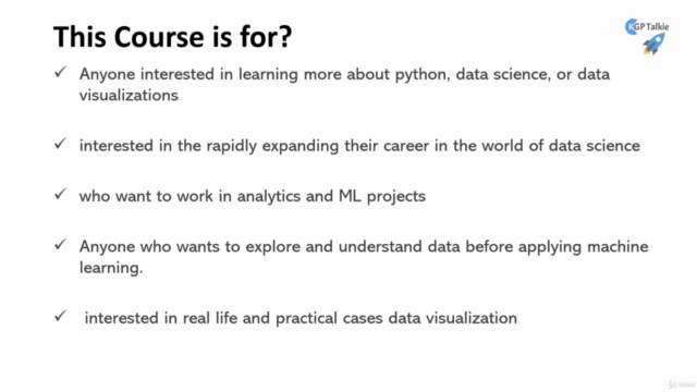
This course is designed for both beginners with some programming experience or experienced developers looking to make the jump to Data Science!

This comprehensive course is comparable to other Data Science bootcamps that usually cost thousands of dollars, but now you can learn all that information at a fraction of the cost! With over 200+ Full HD video lectures and detailed code notebooks for every lecture this is one of the most comprehensive courses on Complete Data Visualization in Python.

We'll teach you how to program with Python, how to analyze and create amazing data visualizations with Python! You can use this course as your ready-to-go reference for your own project.


Here just a few of the topics we will be learning:

  • Programming with Python

  • NumPy with Python

  • Using Pandas Data Frames to solve complex tasks

  • Use Pandas to Files

  • Use matplotlib and Seaborn for data visualizations

  • Use Plotly and Cufflinks for interactive visualizations

  • Exploratory Data Analysis (EDA) of Boston Housing Dataset

  • Exploratory Data Analysis (EDA) of Titanic Dataset

  • Exploratory Data Analysis (EDA) of the Latest Covid-19 Dataset

  • and much, much more!


This Data Visualization in Python Masterclass can help data scientists in several ways:

  • It can help them gain a deeper understanding of how to effectively communicate data insights using visualizations.

  • It can teach them how to use Python libraries specifically designed for data visualization, making it easier for them to create visualizations in their own data analysis projects.

  • It can also provide them with hands-on experience working with real-world data sets, allowing them to practice creating visualizations and improve their skills.

  • It can also teach them to create interactive visualizations which can be used to create dashboards and reports, which can be shared with stakeholders.

  • It can also help them to create visualizations that can convey more information in less space, making it more effective and efficient.


    Overall, this course can help data scientists to become more proficient in creating effective and engaging data visualizations, which can be used to communicate their data insights more effectively.

Content

Introduction

Welcome!!!
Introduction
Q&A Support
Free Coupons for the Next Course
Anaconda Installation for Windows OS
Anaconda Installation for Mac OS
Anaconda Installation on Ubuntu OS
Jupyter Notebook Keyboard Shortcuts
Jupyter Notebook Shortcuts Article
Test Yourself

Python Crash Course

Introduction
Data Types: Numbers
Variable Assignment
String
Test Yourself
List
Set
Tuple
Dictionary
Test Yourself
Boolean and Comparison Operator
Logical Operator
Conditional Statements: If Else and Elif
For and While Loops in Python
Methods and Lambda Functions
Test Yourself
Do you know?

NumPy Crash Course

Introduction
Array
NaN and INF
Statistical Operations
Shape, Reshape, Ravel, Flatten
Test Yourself
Sequence, Repetitions, and Random Numbers
Where
File Read and Write
Concatenate and Sorting
Working with Dates
Do you Know?

Pandas Crash Course

Introduction
DataFrame and Series
File Reading and Writing
Info, Shape, Duplicated, and Drop
Columns
NaN and Null Values
Imputation
Lambda Function
Test Yourself

Data Visualization with Pandas

Introduction
Data Generation
Line Plot
More on Line Plot
Bar Plot
Stacked Plot
Histogram
Box Plot
Area and Scatter Plot
Hex and Pie Plot
Scatter Matrix and Subplots

Matplotlib

Introduction
Line Plot
Label
Scatter, Bar, and Hist Plots
Box Plot
Subplot
xlim, ylim, xticks, and yticks
Pie Plot
Pie Plot Text Color
Nested Pie Plot
Labeling a Pie Plot
Bar Chart on Polar Axis
Line Plot on a Polar Axis
Scatter Plot on a Polar Axis
Integral in Calculas Plot as Area Under the Curve
Animation Plot Part 1
Animation Plot Part 2

Time Series Plots

Dataset Loading
Line and Scatter Plots
Subplots
Heatmap
Histogram and KDE Plots

Seaborn

Introduction
Scatter Plot
Hue, Style and Size Part 1
Hue, Style and Size Part 2
Line Plot Part 1
Line Plot Part 2
Line Plot Part 3
Subplot
sns.lineplot(), sns.scatterplot()
Cat Plot
Box Plot
Boxen Plot
Violin Plot
Bar Plot
Point Plot
Joint Plot
Pair Plot
Regression Plot
Controlling Plotted Figure Aesthetics

Plotly and Cufflinks

Introduction
Installation and Setup
Line Plot
Scatter Plot
Bar Plot
Box Plot and Area Plot
3D Plot
Spread Plot and Hist Plot
Bubble Plot and Heatmap

Analysis and Visualization of Boston Housing Data

Introduction
Data Preparation
Data Deep Dive
pd.describe()
Bar Plot
Plot Styling
Pair Plot
Distribution Plot
Scatter Plot
Heatmap
Correlated Feature Selection
Heatmap and Pair Plot of Correlated Data
Box and Rel Plot
Joint Plot Part 1
Joint Plot Part 2
Linear Regression without ML Part 1
Linear Regression without ML Part 2

Analysis and Visualization of Titanic Dataset

Introduction
Data Understanding
Load Dataset
Heatmap
Univariate Analysis
Survived
Pclass Part 1
Pclass Part 2
Sex Part 1
Sex Part 2
Sex Part 3
Sex Part 4
Sex Part 5
Age Part 1
Age Part 2
Age Part 3
Age Part 4
Fare Part 1
Fare Part 2
Fare Part 3
Fare Part 4
Sibsp Part 1
Sibsp Part 2
Sibsp Part 3
Sibsp Part 4
Parch Part 1
Parch Part 2
Embarked
Who

Analysis and Visualization of Covid-19 Data

Introduction
Data Understanding
Import Packages
Clone Latest Covid-19 Dataset
Import Cleaned Covid-19 Dataset
Import Preprocessed Data
Scatter Plot for Confirmed Cases
Cases Timelaps on Worldmap
Total Cases on Ships
Cases Over the Time with Area Plot Part 1
Cases Over the Time with Area Plot Part 2
Covid-19 Cases on Folium Map
Confirmed Cases with Animation
Confirmed and Death Cases with Bar Plot
Confirmed and Death Cases with Colormap
Deaths per 100 Cases
New Cases and Countries per Day
Correction in Top 15 Countries Case Analysis Part 1
Top 15 Countries Case Analysis Part 1
Top 15 Countries Case Analysis Part 2
Top 15 Countries Case Analysis Part 3
Top 15 Countries Case Analysis Part 4
Top 15 Countries Case Analysis Part 5
Save Figures in PNG, JPEG, and PDF
Scatter Plot for Deaths vs Confirmed Cases
Stacked Bar Plot
Stacked Line Plot
Growth Rate After 100 Cases
Growth Rate After 1000 Cases
Growth Rate After 10000 Cases
Growth Rate After 100k Cases
Tree Map Analysis
First and Last Case Report Time Part 1
First and Last Case Report Time Part 2
First and Last Case Report Time Part 3
Confirmed Cases by Country and Daywise
Covid-19 vs Other Epidemics

Analysis and Visualization of Reviews Text Data

Introduction
Getting Started
Data Import
Data Cleaning
Feature Engineering
Distribution of Sentiment Polarity
Distribution of Reviews Rating and Reviewers Age
Distribution of Review Text Length and Word Length
Distribution of Department, Division, and Class
Distribution of Unigram, Bigram and Trigram Part 1
Distribution of Unigram, Bigram and Trigram Part 2
Distribution of Unigram, Bigram and Trigram without STOP WORDS
Distribution of Top 20 Parts-of-Speech POS tags
Bivariate Analysis Part 1
Bivariate Analysis Part 2
Bivariate Analysis Part 3

Analysis and Visualization of IPL Cricket Matches

Introduction
About Cricket Matches and Package Import
Data Understanding
Wins and Lost Matches Analysis
MoM, City and Venue wise Analysis
MI vs CSK Head to Head Matches
Seasonwise Analysis
Ball by Ball Analysis

Analysis and Visualization of FIFA World Cup Matches

Introduction
FIFA World Cup Data Import
Data Cleaning
Most Number of World Cup Winning Title
Number of Goal Per Country
Attendance, Number of Teams, Goals, and Matches per Cup
Goals Per Team Per Word Cup
Matches with Highest Number of Attendance
Stadiums with Highest Average Attendance
Match Outcomes by Home and Away Teams

Python Coding in Mobile

Introduction
Python in Mobile
Matplotlib Plot in Mobile
Pandas Coding in Mobile
Seaborn Coding in Mobile

Screenshots

2024 Data Visualization in Python Masterclass for Beginners - Screenshot_012024 Data Visualization in Python Masterclass for Beginners - Screenshot_022024 Data Visualization in Python Masterclass for Beginners - Screenshot_032024 Data Visualization in Python Masterclass for Beginners - Screenshot_04

Reviews

Vishwanath
March 28, 2023
Excellent Course In this course, he does a great job explaining from basic to advance and Proper Code Explanation. He broke down complex concepts to easy to understand explanations.
Sonu
December 7, 2022
Instructor explains very thing in very details. Lots of Kudos to Instructor for providing such kind of stuff on Udemy. This course is helping me to get better insight about data
John
October 28, 2022
I find this a really good supplemental course in different aspects of visualizations, coding in Python and working with text. Good stuff.
Neus
August 11, 2022
I've just started the course and I'm very happy so far, as it starts from the very beginning and goes through how to install everything. Other courses don't and that makes getting started much more difficult.
Ana
April 25, 2022
El material que dispone es excelente,(archivos python y contenido del curso). Los ejemplos son muy buenos. No hablo inglés y puedo entender correctamente lo que se transmite.
Ricky
December 10, 2021
I am now at section 3 and the storyline is very bad. Seems like the instructor explains things out of the blue, it is very unpredictable and this makes the lecture hard to follow. The instructor would do good to clarify things, e.g. why he is showing something and what can it be used for. I am quite disappointed in the course. For reference, I have followed another course about Pandas in Python and that one was much clearer.
Nicholas
October 9, 2021
The course contains good nuggets of good data visualisation idea, tips and code examples. However, there are times where it is a case of quantity over quality (in terms of the reason for some of the chart production/exploration).
Nawaf
July 10, 2021
Appreciate your effort done. However, you should have spent more time explaining the use of the features not just typing it.
Lucho
July 3, 2021
This as a helpful introduction to data visualization. I am now ready for more complex data analyses. Thank you Laxmi for your course, patience and explanations. Great course!
Souvik
May 15, 2021
I like your course because of two reasons:- 1)Easy point by point explanations with examples. 2)Your courses are highly organized, structured and consistent.
Harold
April 19, 2021
Excellent course on data visualization as well as analysis. Learned a lot and applicable to my current job. Many Thanks
Vaibhhav
February 24, 2021
Course is detailed enough to work on any live project EDA in ML. The instructor has made it interesting by his lucid style of teaching.
Ganesh
February 6, 2021
I like Laxmi way of training course . This is only course which gives deep in data visualisation in python.he responds to questions as well. I recommended for all users . Hope this get updated on new EDA. Awaiting for your ML and AL course.
Adam
February 1, 2021
Some good concepts, but the instructor doesn't seem to have a good handle on what's in his datasets, so there's a lot of parts that seem non-sensical. Also has parts where very complex portions are just glossed over.
Megala
December 28, 2020
This is a great course in data visualization. There are many libraries which are very helpful from this course. A highly recommened

Coupons

DateDiscountStatus
11/21/2020100% OFF
expired
11/28/2020100% OFF
expired
6/18/2022100% OFF
expired
5/19/2023100% OFF
expired
5/20/2023100% OFF
expired
5/21/2023100% OFF
expired
6/26/2023100% OFF
expired
6/29/2023100% OFF
expired
9/3/2023100% OFF
expired
9/22/2023100% OFF
expired
10/29/2023100% OFF
expired
11/6/2023100% OFF
expired

Charts

Price

2024 Data Visualization in Python Masterclass for Beginners - Price chart

Rating

2024 Data Visualization in Python Masterclass for Beginners - Ratings chart

Enrollment distribution

2024 Data Visualization in Python Masterclass for Beginners - Distribution chart
2994078
udemy ID
4/13/2020
course created date
6/17/2020
course indexed date
Bot
course submited by