Colors for Data Science A-Z: Data Visualization Color Theory

Learn how to apply colour theory to improve your Data Science & Analytics data visualisations and presentations

4.23 (1193 reviews)
Udemy
platform
English
language
Data & Analytics
category
instructor
Colors for Data Science A-Z: Data Visualization Color Theory
7,062
students
4 hours
content
Mar 2024
last update
$84.99
regular price

What you will learn

Use colour schemes to create eye-catching palettes

Assess colour aesthetics of any Data Visualization

Know the difference between RGB vs CMYK

Create impactful Data Science visualizations

Understand how colour schemes work

Know what a tint, shade and tone are

Know what an achromatic colour is

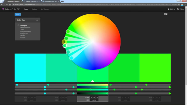
Use tools such as Adobe Color, Paletton and ColorBrewer

Why take this course?

A fun and entertaining journey thorough colour theory and basic colour knowledge to help you create effective Data Science visualisations. 

So why is this an important course for a Data Scientist?

Think about this...

You've just completed an incredible Analytics project. 

You did the data prep, the modeling, and now you have the insights.

But we all know that this is not the end...

You still need to present your findings to your manager, client or even a large audience.

Now this is where the trick is.

A powerful visualization can make or break your project.

And this is where the power of colours comes in!

In this course we will show you where colours originate from and what they mean.

You will finally understand how to make your Data Science visualizations and presentations super-impactful.

Whether you are a beginner or a seasoned Data Scientist, this course will help you truly wow your audience and take your Analytics skills to the next level.

We can't wait to see you inside!

Kirill & Patrycja

Content

Introduction

Welcome to the course

Color Theory

Color Theory Map
What is a color?
The Color Wheel
Tints, Shades and Saturation
Achromatic Colours
CMYK vs RGB
Colour Blindness
Colour Theory

Colours & Emotions

Why this section is important
Meanings of Colours
Warm and Cool Colours
Yellow Orange Red
Blue Green Purple
Colours and Emotions

The Tools

Hello! This is what you will learn in this section
Adobe Color
Paletton
Color Brewer 2.0

Colour Schemes

Colour Context
Colour Schemes
Monochromatic Colour Schemes - REAL Data Examples
Analogous Colours - REAL Data Examples
Complementary & Split-Complementary Colours - REAL Data Examples
Triadic & Tetriadic Colours - REAL Data Examples
Colour of the background
Colour Schemes

Data Science Project Walkthrough

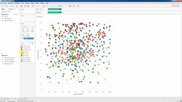
Project Brief: Vitamin Trials
Download & install Tableau Public
Buildining the visualization
Testing out color palettes
Applying the split complementary color scheme
Coloring the subcategories
Applying the triad color scheme
Applying the analogous colour scheme
Section recap

Bonus Section

Your Super-Special Invitation

Screenshots

Colors for Data Science A-Z: Data Visualization Color Theory - Screenshot_01Colors for Data Science A-Z: Data Visualization Color Theory - Screenshot_02Colors for Data Science A-Z: Data Visualization Color Theory - Screenshot_03Colors for Data Science A-Z: Data Visualization Color Theory - Screenshot_04

Reviews

Katina
August 27, 2023
I thought there would be more information and practice on how this applies to visualizations and how to improve upon visualizations through color theory. It is some really good information, but it's more about the background of color theory compared to practical applications.
Roshni
July 16, 2023
Understanding the theory of color was beneficial, although it would have been better to minimize the repetition of terms like "scheme" and "concept." Instead, more time could have been dedicated to providing illustrative examples by visualizing alternative charts.
Mohammad
April 3, 2023
Few eye contact to audience, instructors kept looking at each other making me feel like I'm intruding into their private space. Some lessons felt like they were thought up on the spot, making me feel unsure if what they say is true or not.
Paulina
December 28, 2022
I really enjoyed the idea to present artist vs nerd approach, it feels both light and pragmatic that way + was nice to see that presenters were having fun with this work. Definitely useful for any of my future report with visualization.
Vivek
December 16, 2022
Could've been more detailed about color theory. Started off strong and got better toward the end. It was nice to see chemistry between the hosts, but some of the banter could have been reduced.
Cristina
August 11, 2022
I want to emphasize a pleasant and eloquent presentation of the two cool presenters :) the material is very well structured, time is used efficiently keep goin'
Jamie
June 28, 2022
The content is incredibly useful and I'm glad I took the course; but the instructional style left something to be desired. Kirill is a wonderful teacher - I love his other Udemy courses - but this instructional pairing was more distracting than it was engaging. The dynamic between the two them felt awkward (even strained at times) and they addressed each other more often than they spoke to the audience. The result was a less-than-captivating, and somewhat disorganized-feeling, lesson. It's entirely possible that my frustration stems from personal learning preferences; but for me, two instructors felt like one too many.
Honey
April 6, 2022
The course was great, I think it didn't have these practical examples earlier, at least that's what I can make from the older reviews. The only minus was the lack of chart types discussed during the hands-on exercise. Otherwise a fine course with a good blend of live examples and theory. I ran it at 1.75x but perhaps that's just personal preference.
Dan
February 4, 2022
This course is EXCELLENT! I develop visualizations in Tableau everyday but hesitate to go beyond the canned color pallets provided by the tool because every time I do it looks awful. I feel empowered to experiment now using the concepts and tools provided in this course! Thank you! P.S. the Artist and Nerd thing really works!
Ahmed
November 28, 2021
It is only discussing the colors and visualization in the presentations and i wanted a course which is a design or photography coloribg related
Aakarsh
October 13, 2021
Jovial and made the learning experience quite pleasant and simple, with the crisp and humorous content.
Ahmed
April 25, 2021
It was a very nice experience to learn the color schemes and how important it's to choose the colors wisely for the data visuals to be most useful.
Dunja
March 17, 2021
I really like how this course is packed with basic and practical information about color theory and schemes. It gave me good perspective how to connect a color with data in data storytelling. It also gave me some ideas how to use this knowledge on some other projects of mine. If you're new in data visualization, this is the course you should take to learn how to use color to present data and communicate with your audience as it is important part of data science job.
Carlo
February 26, 2021
I found the content lackluster; between the music into/altro, the chatter and interactions between the speakers, and the slow pace, I would not recommend this for a Data Science course.
Hunter
February 8, 2021
It is a good course, especially if one is looking for a basic foundation in color theory and application. The course does have quite a bit of fluff which dilutes the content. I did appreciate the resources and tools that the authors used in the course. All in all it was worth the discounted price that I paid.

Charts

Price

Colors for Data Science A-Z: Data Visualization Color Theory - Price chart

Rating

Colors for Data Science A-Z: Data Visualization Color Theory - Ratings chart

Enrollment distribution

Colors for Data Science A-Z: Data Visualization Color Theory - Distribution chart
1123198
udemy ID
2/22/2017
course created date
11/21/2019
course indexed date
Bot
course submited by