Build an Interactive Data Analytics Dashboard with Python

Learn and complete all of the steps to deploy your very own data analytics dashboard on the web with Python

4.10 (131 reviews)
Udemy
platform
English
language
Other
category
instructor
Build an Interactive Data Analytics Dashboard with Python
2,874
students
12 hours
content
Oct 2022
last update
$84.99
regular price

What you will learn

Build an interactive data analytics dashboard using the Dash library in Python

Model coronavirus cases and deaths using generalized logistic functions

Smooth data using locally weighted scatterplot smoothing

Read and clean data so that it is suitable for modeling

Learn how to use Plotly, an interactive data visualization library in Python targeting the web

Learn HTML and CSS fundamentals to add and style elements of the dashboard

Setup an Ubuntu server running NGINX to host the dashboard on the web for all to see

Run nightly cron jobs to update the data and model predictions

Encapsulate all of your code into Python classes to ease automation

Learn how to complete a comprehensive, end-to-end project in Python using a vast array of skills

Why take this course?

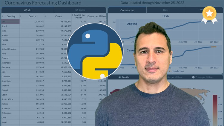
This course teaches you all of the skills to build interactive data analytics dashboards with Python. Specifically, you will be building a Coronavirus Forecasting Dashboard that shows historical and predicted values for deaths and cases for all countries in the world and US states from the ongoing coronavirus pandemic. The final product will be a live dashboard, automatically updated daily, hosted on a remote server for anyone, anywhere in the world to see!

You will learn and complete the entire process for building the dashboard including the following topics:

  • Getting, Cleaning, and Transforming the Data - You will learn how to collect the data, find and clean bad data, and transform it so that it can be used for building models capable of prediction.

  • Data Smoothing - You will learn several different techniques such as LOWESS to smooth the jagged raw data so that the model can better detect trends.

  • Exponential Growth and Decline Models - You will begin modeling coronavirus cases for each area of the world with these simple models that can capture a single exponential growth or decline phase, but not both.

  • Logistic Growth Models - You will learn about a separate class of "S-Curve" models capable of capturing both exponential growth and decline in the same model.

  • Modeling New Waves - Coronavirus cases appear in waves over different time periods. You will learn how to change your model so that it can detect any number of new waves in the future.

  • Encapsulation into Classes - After selecting your model, you will encapsulate all of the code together into Python classes, eventually to be used in your final production code.

  • Visualizations with Plotly - You will learn how to use the Plotly Python library to create interactive data visualizations targeted for the web

  • HTML and CSS - You are building a web application and will learn the fundamentals of HTML and CSS to help add customization with the help of Dash.

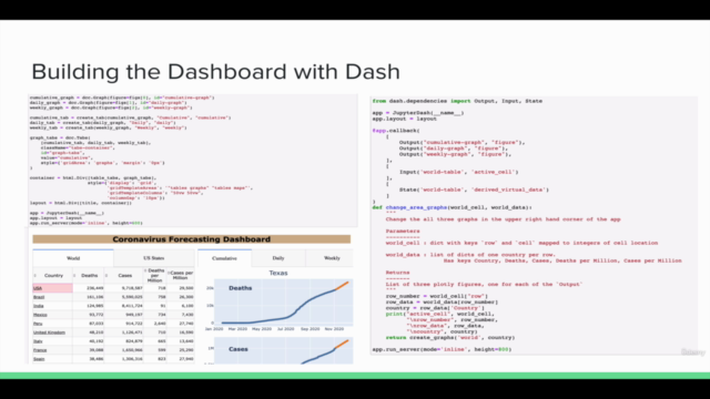
  • Building the Dashboard with Dash - You will learn how to build all of the components and interactivity of the dashboard with the Dash Python library.

  • Deployment - One of the most exciting parts of a project is deploying it on your own server for the world to see. You will learn two different deployment options - one simple and the other more complex, but with more flexibility.

What's Included?

This course comes with a massive amount of material including:

  • 13 Jupyter Notebooks

  • 26 Exercises with detailed solutions

  • 200 page PDF of the entire course content

  • All production code for the dashboard

Technologies used

  • All code for developing the dashboard will be done using Python

  • Pandas will be used extensively for analyzing and transforming data

  • Statsmodels will be used for smoothing

  • Scipy will be used for building the models for coronavirus cases and parameter optimization

  • Matplotlib will be used in the notebooks for static visualizations

  • Plotly will be used for interactive data visualizations that appear in the dashboard

  • Dash will be used for building the dashboard itself

  • HTML/CSS will be used together with Dash to customize components of the dashboard

  • You'll learn how to setup your own Linux Ubuntu server to run your dashboard

Screenshots

Build an Interactive Data Analytics Dashboard with Python - Screenshot_01Build an Interactive Data Analytics Dashboard with Python - Screenshot_02Build an Interactive Data Analytics Dashboard with Python - Screenshot_03Build an Interactive Data Analytics Dashboard with Python - Screenshot_04

Reviews

Niels
May 11, 2023
Awesome end to end course. I learned everything from extracting, transforming, storing and visualizing data with python, creating a web page and deployment on different servers options. I have some C# experience but no python or linux experience but now I feel comfortable in creating my own online dashboards from scratch. Thank you very much for this course!
Veeraphat
May 26, 2022
This course was great and lot of information. Although I think some codes, code structure and variable names can be simpler and easier and this course is more like code walkthrough
Eduardo
May 13, 2022
I like how Mr. Petrou organized the course and that he seems to be interested that his students learn them well.
Jaap
April 25, 2022
Duidelijke lesstof met wat je aan het doen bent. Ook fijn dat het het in blokjes van 1 tot 10 minuten is zodat je het ook tijdens kleine pauzes kan doen en zo vorderingen kan blijven maken. Docent reageert ook snel en adequaat.
Steven
March 4, 2022
I have taken over 50 classes on Udemy and Coursera and this is one of the best classes I have ever taken. It is clear that Mr Petrou has put in a lot of effort to produce this excellent class. He is also an excellent instructor. His book "Pandas Cookbook" is a great resource that I have found myself referring to again and again even though I own many Python books. When I learned he was teaching this class on Udemy, I jumped at the chance to enroll. Needless to say, I had high expectations since I am a huge admirer of his book, I am happy to say that he has surpassed my expectations with this class. I hope he continues to offer classes, I will take them all. Well done !!
Jerum
January 27, 2022
The lessons are very informative and the project was built from the ground-up which is great. However, I just saw 2 items that can be improved on the way of teaching but that's just me. First is, it's like watching a code walk-through session which sometimes makes me loss my interest on the topic. I still prefer the actual coding demonstration style. Second, the material is very different from the demo and it confuses me on some sessions, specially if the headers are different or missing. But that's just me. Overall, the lessons are great and the instructor is very knowledgeable but the way of teaching and materials can be further improve. Thanks!
Scott
November 11, 2021
Logical progression from getting and cleaning data to developing a model and deploying with dash. The Dash and Deployment sections will be useful for future projects.
Phu
November 3, 2021
Great course that is focused on learning by doing a project end to end. I particularly liked the modeling, visualization, and deployment sections. The course was very detailed and well done. The instructor's voice was clear and likeable as well, lol, I know that shouldn't be important, but it mattered to me :)

Charts

Price

Build an Interactive Data Analytics Dashboard with Python - Price chart

Rating

Build an Interactive Data Analytics Dashboard with Python - Ratings chart

Enrollment distribution

Build an Interactive Data Analytics Dashboard with Python - Distribution chart
3918982
udemy ID
3/16/2021
course created date
10/23/2021
course indexed date
Bot
course submited by