Bar Graphs Unveiled: A Comprehensive Introduction
Unlocking the Power of Bar Charts for Effective Data Communication
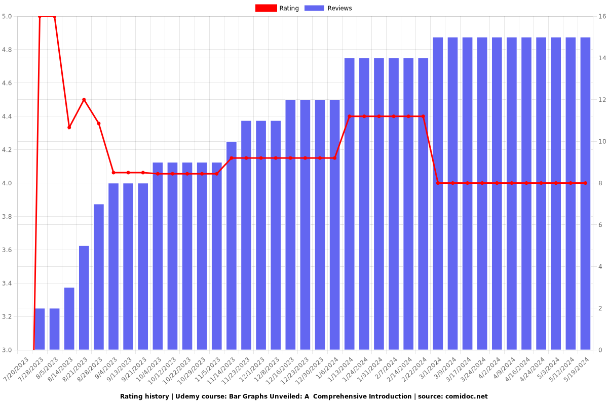
4.00 (15 reviews)

6,128
students
43 mins
content
Oct 2023
last update
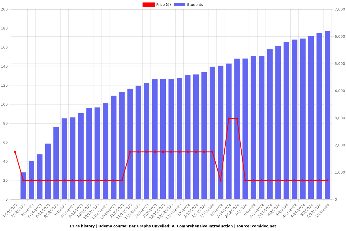
$19.99
regular price
What you will learn
If a survey is conducted to find out the causes of illness and death among women, then how to represent the survey figures in the form of a graph.
If the data on the number of girls per thousand boys in different sections of the society is given, then how to represent the information given by way of a bar.
If the data in respect of seats won by different political parties in polling outcome of state assembly elections is given, then how to draw the bar graph.
Whether bars in the bar graph are drawn vertically or horizontally?
Why take this course?
📊 **"Bar Graphs Unveiled: A Comprehensive Introduction to Effective Data Communication"**
**Course Description:**
Are you ready to transform the way you present data? Dive into our comprehensive course on Bar Graphs and master the art of visual storytelling. Whether you're analyzing health trends, demographic statistics, or election results, bar graphs are a versatile tool that can turn complex information into clear, actionable insights.
**Unlocking the Power of Bar Charts:**
- **Understanding Data Representations:** Learn how to visually represent survey data on causes of women's illness and death globally, enabling you to pinpoint major health concerns. 🌟
- **Analyzing Societal Trends:** Discover how to illustrate the gender ratio in different societal sections with bar graphs, and draw meaningful conclusions from these visualizations. 👩🦰👨👩👧
- **Political Data Visualization:** Examine the effectiveness of political parties in state assembly elections by crafting compelling bar graphs that encapsulate polling outcomes. 🗳️
**Bar Graph Fundamentals:**
- **Purpose of Bar Graphs:** Explore the 'why' behind using bar graphs for data representation and learn when they are most effective.
- **Orientation Matters:** Understand the significance of choosing between vertical or horizontal bars based on your data and the message you wish to convey. 🡪
- **Design Considerations:** Grasp the nuances of spacing between bars, bar width, and adjoining bars for optimal clarity and impact.
**Bar Graph Complexity:**
- **Simplicity for Clarity:** Learn how bar graphs can simplify complex datasets into easily digestible information. 🎯
- **From Data to Insights:** Turn raw numbers into clear, compelling stories that your audience can understand at a glance.
**Course Highlights:**
- **Real-World Applications:** Apply your new skills to real-world scenarios across various fields including health, demographics, politics, and more.
- **Interactive Learning:** Engage with interactive exercises that solidify your understanding of bar graph design and analysis.
- **Expert Guidance:** Follow step-by-step instructions from our seasoned course instructor, Prabh Kirpa, who brings a wealth of experience in data visualization.
By the end of this course, you'll have the confidence to present data with clarity and precision using bar graphs. Enroll now to start your journey towards becoming a data visualization expert! 🎓🚀
**Join us and make your data speak volumes with the power of Bar Graphs!**
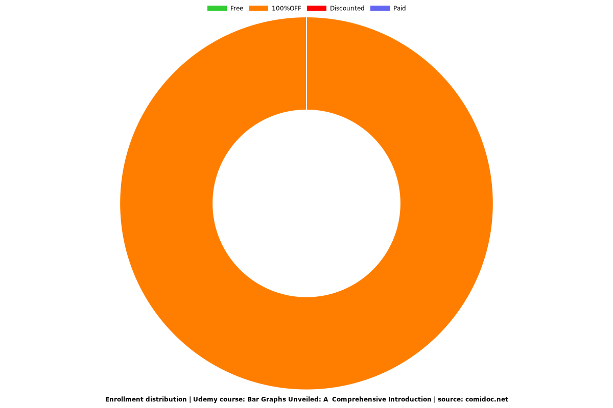
Charts
Price
Rating
Enrollment distribution
5454606
udemy ID
7/20/2023
course created date
7/20/2023
course indexed date
Prabh Kirpa Classes
course submited by